Of course I knew colour was coming soon and at first I was excited to play around with it but then I was apprehensive. Partly this is due to getting used to handling new media and not really having a clue but also, after a few sketches, I was generally unimpressed with my efforts. I’m not sure if there is a mental block that I need to overcome but this week has been a challenging one.
I decided to start with oil pastels as I could sweep them across the page in broad strokes of colour as directed. For a change, I elevated my still life arrangement and placed them on a box for a slightly different view. The oil pastels were not enjoyable to use, they felt hard and sticky, not smooth as I had imagined. I struggled with them for a while, then googled how to use them and tried using my fingers to move the pigment around a bit, which had a very limited success. Sadly, although I worked fast and spontaneous as instructed, I thought the end result was rather childlike.
Feeling a bit discontented, I reverted to compressed charcoals, and drew on black sugar paper as I felt I needed to locate myself again, trying to get shapes and tone correct.
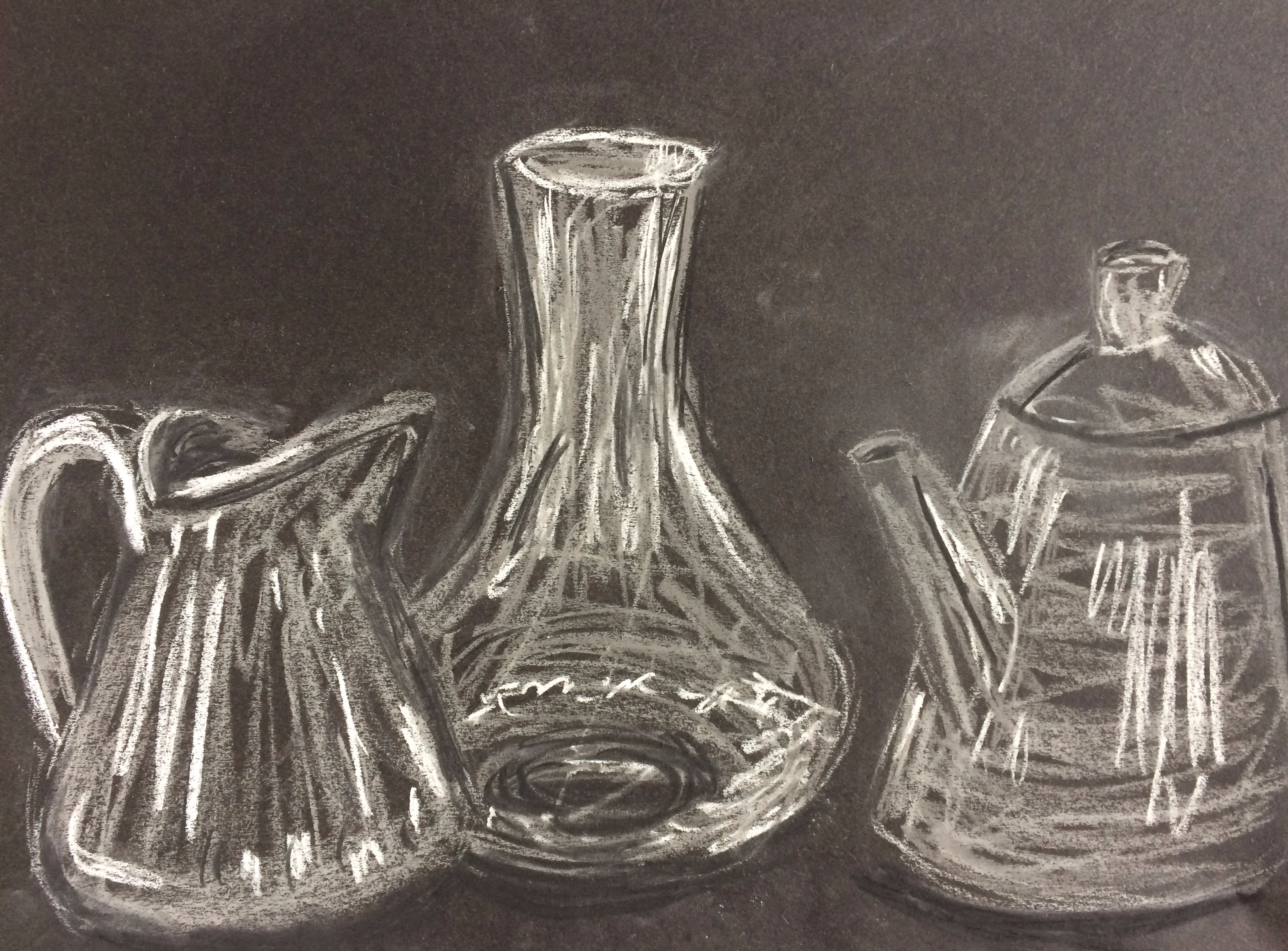
Working fast and loosely, I think these shapes are more convincing and I’m happy that I made a range of different marks, this is something I need to expand on but it’s not coming naturally. The proportions are not quite right but I decided speed was more important. I changed the arrangement and made sure the tea spout was not getting lost in the carafe.
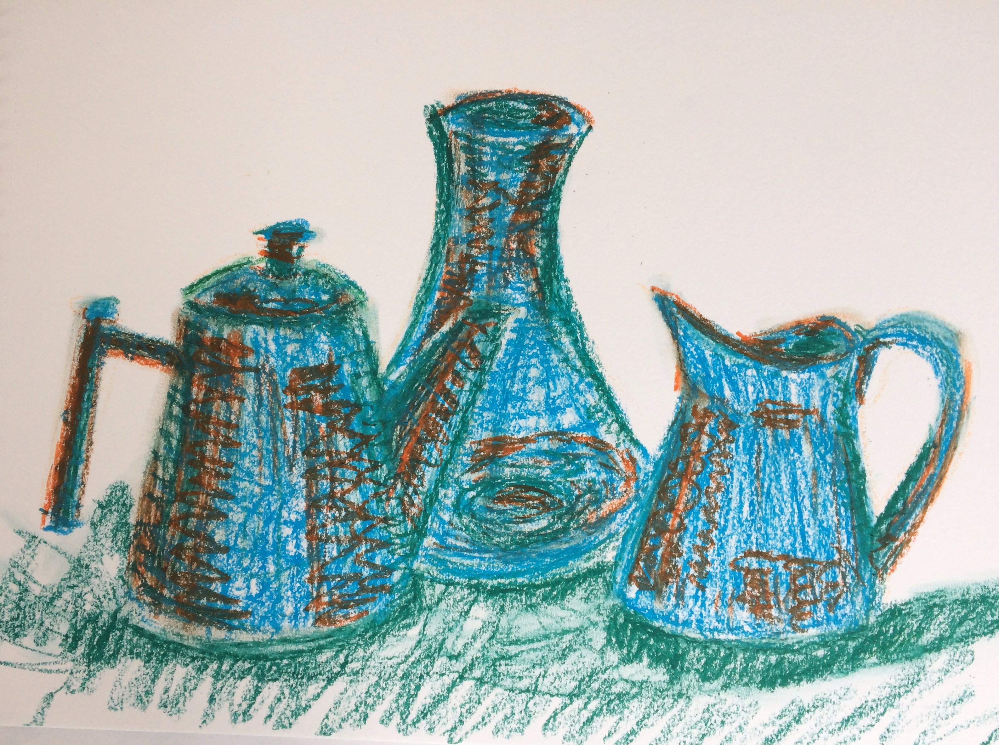
Next, I tried conté sticks, trying to keep it fast and free. After doing this one, I re-read the exercise and felt like I wasn’t really happy with the results. Felt a little frustrated but figured I just needed to keep trying.
The next day I decided I would quickly rework the two drawings before I tried something else, making sure not to spend too much time on them.
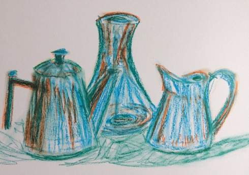
This is the reworked oil pastel
I don’t think I’m ever going to love this but am happier with the tea pot and the carafe. Now that I’ve photographed and uploaded this, I don’t think the jug works, but I think the shapes are more solid than before.
I definitely had problems with the restrictions of the media, I really wanted to get a brush and some turps and work into it, but then it would be a painting no? As I have a tendency to spend too long working detail into drawing and sketching, I was determined not to spend hours over it thus overworking it. I’ve only achieved a very limited amount of depth, purely by placing the carafe at the back.
Being restricted to line makes it seem quite stiff and artificial, obviously the colours contribute to that too but that seems to be the point of the exercise, it doesn’t say to represent the colours realistically. I found the example by Michael Coombes to be misleading, as it doesn’t seem messy and spontaneous to me and has clearly used many different colours.
The use of colour at first distracted me but I don’t think it adds anything to this drawing.
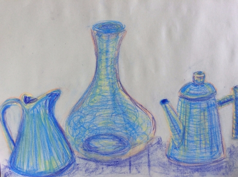
I also reworked the conté stick drawing
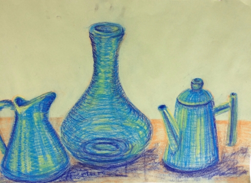
Finally an improvement, this time I am happier with the jug and the carafe, they look more solidly in place and appear to exist as real objects, more so than the previous drawing. Once I added the edge of the table, and more contrast there seems to be a better sense of depth. Again, the proportions are slightly off but I was trying to be fast and not overdo it. I think the line works better, the curved shapes in the carafe give it more definition and in the jug, the teapot seems to be standing upright so the effects have worked somewhat.
Having reviewed this again, I’m still not sure I have successfully completed this exercise, especially when viewing the example by Michael Coombs. It seems to me that his drawing is not a fast sketch but rather a detailed drawing that uses many different colours rather than the three we were asked to use. The example given is not messy and energetic but rather controlled and, I’m guessing probably took a long time to complete.
As I was feeling unsure about this exercise I did it again! This time with a lovely set of Unison soft pastels, they are thick and chunky and glide over the paper leaving a lot of colour behind.
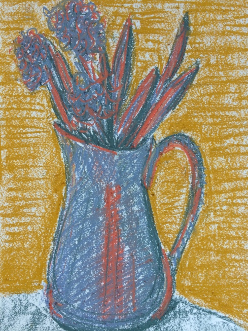
It’s far from perfect but it is messy, and has sweeps of colour. I couldn’t really put any more pigment over it, it is so thick already but I changed the direction of my marks to add solidity and definition in the background. I can see I need to work on tone, but this was quite a restrictive exercise, only using 3 colours, but the colour does add something expressive. I feel like there is some emotion now, it’s a happy drawing of a sunny jug of flowers, it was sunny when I drew it. It was hard to add more depth, although I did try, the pastels are so chunky and it was hard to add a lot of contrast. I kept the composition very simple as I knew it would be very difficult to draw a lot of detail with the chunky pastels and I would argue that this adds to the jovial mood.
Using colour was most definitely challenging, at one point I wavered and reverted back to black and white as I felt a bit lost. I do find the black and white drawings useful to place everything on the page, and when deciding on the composition too. I wouldn’t say I was completely comfortable using colour yet, there is a long road ahead.

The re-worked oil pastel is great – a very strong drawing with lovely loose lines and strong colours. The line between drawing and painting is very confusing – I’m forever ‘quickly washing some water over it’ to make a stronger image….!!!
LikeLiked by 1 person
thank you for your kind words. Feeling somewhat frustrated with part two so nice to hear something positive!
LikeLike
Me too so far, i’m certainly not finding it as fluid as part one. can’t explain why but it just feels a lot heavier going.
LikeLiked by 1 person
Couldn’t agree more. Feel a bit bogged down alright
LikeLike
I found your post really helpful – I too struggle with colour and am viewing that section of the course with trepidation! I also find there are times when I just can’t gel with what I’m meant to be doing and it can be really frustrating and disheartening. I love your reworked conte stick drawing, and the vase of flowers is lovely.
LikeLiked by 1 person
thank you! I am hoping it will start to gel with me soon, it’s funny how adding colour is so challenging. I’m having an off day today so need to do something else, I think that’s ok though
LikeLiked by 1 person
I had a rubbish art day on Monday but was back on form by the following day! Think it’s important to accept an off day (or even week!) for what it is 🙂
LikeLiked by 1 person